
The autumn-winter 2025 palette is based on a logic that most style guides overlook: readability on screen as well as impact in person. The Pantone Fashion Color Trend Reports articulate saturated hues (bluish reds, electric blues, deep greens) with soothing tones, because clothing is now worn as much on a feed as it is on the street.
The color must work in phygital, meaning it should maintain its depth in a JPEG-compressed photo as well as under natural lighting. Understanding this dual requirement allows for more sustainable wardrobe choices than simply reproducing a seasonal color chart.
Recommended read : Discover the benefits of a relaxing massage and reflexology at Edayspa
Autumn-Winter 2025 Colors and Phygital Constraint: What Saturation Changes
The shades selected by trend offices for this season are not random. A blue-tinged red (like cool burgundy) retains its chromatic richness once photographed in artificial light, whereas an orange-tinged red turns dull. Klein blue, prominently featured on runways, offers a high native contrast with most skin tones, making it immediately identifiable in miniature on a smartphone screen.
We observe the same logic with saturated greens and teal (duck blue). These shades maintain their density after digital compression, a criterion that WGSN and Trend Union now incorporate into their forward-looking reports. For a thoughtful purchase, prioritize pieces whose color does not fade under office neon or in an Instagram story.
You may also like : Discover the benefits of knitting and crocheting for your daily well-being
By studying the trendy colors of autumn-winter 2025, we can clearly identify this dual requirement for visual depth and digital versatility in each proposed shade.
Burgundy and Terracotta Browns: A Refuge Palette Linked to Climate Anxiety
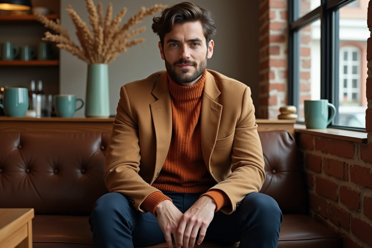
Burgundy dominates the season, and this is not an aesthetic coincidence. Several style offices, including WGSN, link the rise of browns and terracotta reds to a demand for comfort in the face of climate and geopolitical anxiety. These shades function as refuge colors, associated with stability and grounding.
This phenomenon goes beyond fashion. The same shades are progressing in interior decoration, creating a continuity between the clothing worn and the space inhabited. When your burgundy knit sweater resembles the color of your cushions, it’s not a coincidence: it’s a cross-cutting trend documented in foresight studies.
How to Wear Burgundy Without Monotony
Burgundy works in a total look as long as the materials are varied. Burgundy leather (or matte faux leather) pants paired with a ribbed knit sweater in the same chromatic family create a contrast of textures that avoids a uniform effect. Corduroy burgundy remains the most versatile piece of the season, wearable from the office to the weekend.
To break the sobriety, burgundy pairs well with camel or mustard, two warm tones that are very present this winter. We recommend avoiding the burgundy-black combination, which weighs down the silhouette without adding any contrast.
Fashion and Makeup Convergence: Coordinating Clothing and Makeup Shades
Recent seasons confirm an increasingly clear synchronization between clothing colors and makeup shades. For autumn-winter 2025, gold, bronze, copper, and saffron tones are found on both sweaters and eyelids. Moss green and duck blue transition from coats to eyeshadow.
This convergence is not trivial. It changes the way a look is constructed: the choice of lipstick influences the color of the turtleneck, and vice versa. Specifically, a look centered around chocolate brown gains coherence with bronze-copper makeup, while an anthracite gray outfit pairs better with a complexion worked in cool tones.
The Most Effective Combinations This Season
- Burgundy or terracotta clothing with makeup in copper and saffron tones, extending the warmth of the outfit to the face
- A piece in duck blue or teal paired with a moss green eyeshadow touch on the mobile eyelid for a subtle chromatic reminder
- Total anthracite gray look highlighted by a bluish red lip, the only splash of color that works without overwhelming
- Pastel pink sweater (a strong trend this season) coordinated with a natural rosy blush, avoiding fuchsia pink which creates too stark a break
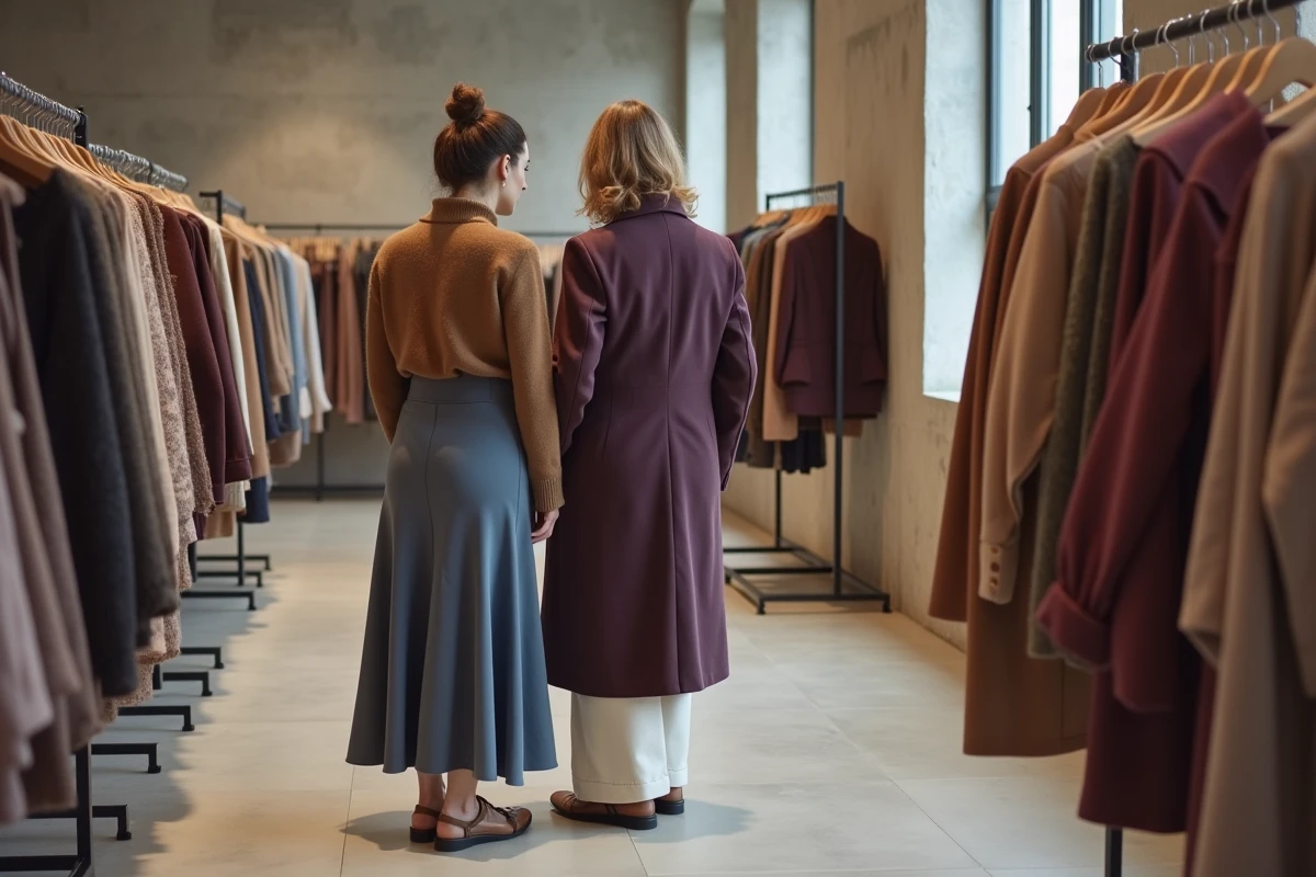
Key Pieces for Autumn-Winter 2025: Materials and Colors to Combine
Soft leather in caramel or chocolate shades remains the textile thread of the season. It can be found on oversized trench coats, midi skirts, and structured shirts. Matte faux leather, in an eco-friendly version, offers a comparable look for a more accessible budget.
Thick knit in cocoon style (loose sweaters, long cardigans) primarily comes in burgundy, camel, and anthracite gray. Tweed makes a marked return, especially in short jackets, in colors blending several tones from the seasonal palette.
Combining Shades Without Faux Pas
Some coordination rules work particularly well this season:
- Burgundy and camel form the safest duo, applicable from coats to bags to shoes
- Klein blue and anthracite gray create a clear contrast without aggression, suitable for professional outfits
- Mustard and chocolate brown recall the palettes of the 1970s, a retro nod embraced by several houses this season
- Pastel pink and off-white bring softness to the grayest days, to be reserved for upper pieces to maintain visual grounding
Avoid pairing more than three strong colors in one outfit. The richness of the autumn-winter 2025 palette encourages mixing, but a readable look relies on two dominant shades and a punctuated accent.
The colors of this season share a rarely highlighted common point: they age well. Burgundy, camel, anthracite gray, chocolate – none of these shades will become dated in six months. Betting on them means building a wardrobe that transcends seasons without losing its coherence.